Project Overview
The goal of onehundred is to provide users with a toolkit to teach them the basic techniques of app design on mobile devices before they begin their app-making journey, which hopefully reduces the learning curve by having less of what I call «First Steps» issues. If someone has never designed or had no idea how to use an app before, it’s only natural that they’d run into problems. The UI kit also includes tools like color palettes and a design system, so designers can more easily and faster without having too many issues on their way.
In-app design, there are a lot of things to be considered. The app’s look and feel, its interaction with users, how it affects end-users experience, etc. It can be a daunting task that designers should learn from or know about before diving into app design. Here are some of the common issues we’re trying to solve using this UI kit:
First Steps Issues – one of the most common problems associated with beginners is a lack of knowledge of app design. Some designers make their app design process too complicated by creating designs from scratch or starting with extensive plans. The result is unusable apps because app developers have no idea what they’re working with.
App Design Process – app design isn’t linear. App designers often go through many revisions to find the right app design that users will like. They also need to keep track of their app designs before they start developing their app. This process can take months or years before an app is ready for development, and it gets tough to keep track of everything involved in app design because a lot is going on.
Awareness – beginner designers may not view UI kits as must-use tools but should be helpful for everyone, even if they’re already using other templates. We’ve seen a lot of people who would use a specific component from a UI kit and then spend time changing colors or drawing custom buttons for his app. app design is hard, and we’re trying to save designers time with this kit.
Creating Consistent Designs – app consistency is important because app users expect a specific look and feel from apps they like and return to use again. App design isn’t about changing colors, moving buttons around, or adding new elements willy-nilly. A cohesive app experience depends on its look and feels and how it interacts with its users (i.e., navigation).
App Design Resources – this UI kit is by no means the only resource out there on app design concepts and processes. It contains some of our favorite resources, but there are plenty more where those came from! What you see here are just starting points, so explore your resources before designing your app.
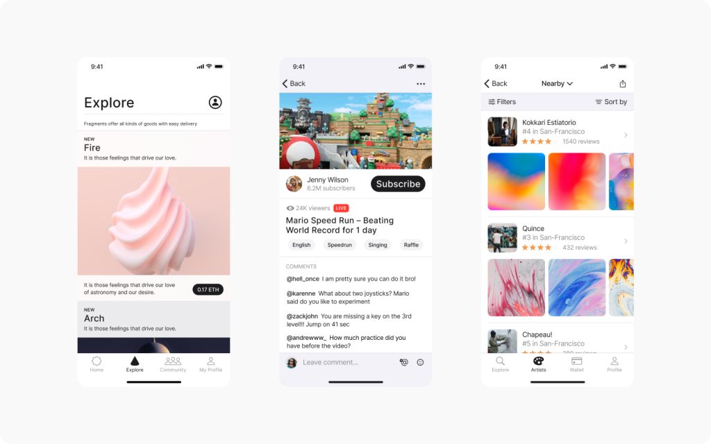
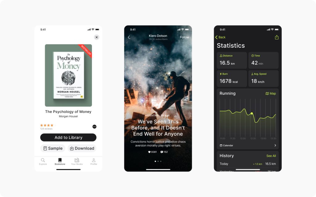
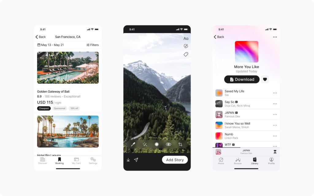
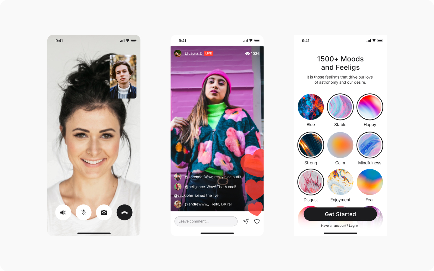
The Figma file contains a series of screens, color schemes, and a design system that create a cohesive app experience. You can use these tools to design your app or simply browse the components and copy/paste anything that works for you.
I did this project with beginners in mind, but I’m sure it’ll be helpful for more experienced designers as well. Whether you’re looking to familiarize yourself with app design or learn some new tricks, onehundred can help you get there. The UI kit includes color palettes, icons, buttons, cards, and standard components for major app companies like Google and Apple. Before you design your app from scratch, which can take a long time, you should acquaint yourself with what’s available on the web to have fewer issues related to First Steps. You don’t have to use all these templates at once! Just try one or two things at a time before your app idea becomes more fleshed out.